


How to Get the Texture of Your Favorite Artist in AI Without Typing Their Name
Typing an artist’s name into a prompt feels like a shortcut because it is short. It is also the least controllable way to get a look. A name stands for hundreds of decisions at once: the subjects they paint, the era they worked in, how thickly they load the brush, how they handle a shadow. You get all of those decisions together, with no way to keep the one you wanted and drop the rest.
The method in this article works for any painter or illustrator you admire. You take the look apart into plain craft words, put those words in your prompt, and adjust them one at a time in kre8or.ai.
Why dropping an artist’s name is the weakest shortcut
A name gives you a package. If you love the soft, hazy edges in one painter’s landscapes but the name also pulls in their favorite subjects and their color habits, you cannot separate the two. When the result is close but not right, you have nothing to adjust. All you can do is retype the name and hope.
Names also make your work look like everyone else’s. Thousands of people type the same name, so the results cluster around the same few associations. A prompt made of your own observations about edges, grain and light is specific to you, and it produces something nobody else’s prompt produces.
There is a practical problem too: a name teaches you nothing. If it works, you do not know why, so you cannot carry the result to a new subject. If you describe the texture in craft terms, you can reuse that description on a harbor, a portrait or a kitchen table.
Finally, many working artists object to having their names used as prompts, and their living depends on their recognizable style. Describing the qualities you respond to, rather than invoking a person, is the cleaner way to take inspiration. It also happens to be the better technique.
Read the texture like an artist: brushwork, edges, grain and surface
Before you can write a prompt, you need to see the image in parts. Pick one piece you admire and spend a few minutes looking at it in four ways.
Brushwork (or mark-making). Look at the individual marks. Are they large and flat or small and quick? Do they follow the form of the object, run in one direction, or crisscross? Can you see where each stroke starts and stops, or is the paint blended smooth? For pencil, ink or digital work, the equivalent is line weight: whether lines are thin and even, thick and variable, or scratchy and broken.
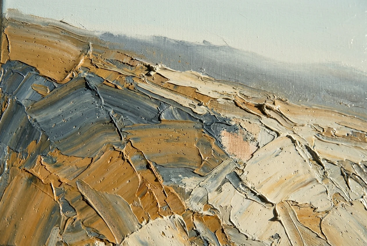
Edges. Edges are where one shape meets another. A hard edge is a sharp, clean boundary. A soft edge fades gradually. A lost edge disappears into the background so the eye fills it in. Many images that feel “dreamy” or “painterly” come mostly from how they treat edges, so this is worth studying closely.
Grain. Grain is the fine-scale texture over the whole image. It might be paper tooth showing through watercolor, the weave of canvas, film grain in a photograph, or the speckle of a risograph print. Zoom in or lean close to the screen and look at an area with no detail, like a sky or a wall.
Surface. Surface is how the finished piece would feel and reflect light if you held it. It can be matte and chalky, glossy like fresh oil, cracked like old varnish, or flat like screen print. Surface also covers thick paint that catches light on its ridges.
A useful trick is to squint at the image until the detail blurs. What remains is the big pattern of light, dark and color. Then do the opposite and look at a small crop. The squint tells you about palette and light, and the crop tells you about marks, edges and grain.
Translate “that painter I love” into words the model can use
Most of us start with a feeling: moody, warm, gritty, dreamy, raw. Those words are real, but each one covers many possible images, so they make weak prompts on their own. The job is to turn each feeling into the concrete observations behind it.
Here are some examples of that translation:
- “Dreamy” might become soft lost edges, low contrast, hazy diffused light and a pale palette.
- “Gritty” might become coarse grain, high contrast, desaturated colors and rough, scratchy line work.
- “Painterly” might become visible broken brushstrokes, thick paint and a matte canvas surface.
- “Vintage” might become faded color, soft film grain, slightly warm highlights and low sharpness.
Your own observations will differ, and they should, because you are describing what you actually see in the piece you admire. The exercise is to write down five craft words or short phrases for it. Aim for nouns and adjectives you could point to in the image: “thick impasto strokes,” “chalky matte surface,” “muted ochre and slate blue,” “low raking light,” “broken edges.”
If a word could describe a hundred different images, replace it. “Beautiful” and “stunning” tell the model nothing. “Soft edges against a hard-edged focal point” tells it something specific.
Build the prompt in layers: medium, mark-making, palette, light
Once you have your five words, put them into the prompt in a consistent order. A layered structure makes it easy to see which layer to change later. A reliable order is subject, medium, mark-making, palette, light, surface.
Here is a worked example:
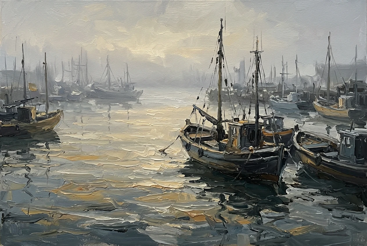
A fishing harbor at dawn, oil on canvas, thick visible brushstrokes with ridged palette-knife marks, soft lost edges in the distant boats, muted ochre and slate-blue palette, low diffused morning light, matte surface with fine canvas weave
Each layer does a separate job:
- Subject: what is in the picture. Keep it simple so it does not compete with the texture words.
- Medium: the material the image appears to be made with, such as oil on canvas, gouache, charcoal, linocut or ink wash.
- Mark-making: the brushwork or line quality you identified.
- Palette: the colors, described by name and mood rather than just “colorful.”
- Light: direction, softness and time of day.
- Surface: the grain, weave or finish.
If you are new to structuring prompts at all, the basics in Graphic Prompts That Turn Any Idea Into Art on kre8or.ai cover how to write a clear subject and build from there. For two examples of this kind of vocabulary working in practice, see How to Get a Watercolor Landscape Look in kre8or.ai, where the medium and surface words do most of the work, and The Pixel Art Vocabulary That Makes kre8or.ai Nail 8-Bit and 16-Bit Styles, where precise terms replace vague style labels.
Test it in kre8or.ai by changing one word at a time
Your first prompt is a hypothesis about what makes the look. To find out which words matter, run it, then change one thing and run it again.
Start with a baseline: your full layered prompt, generated as written. Then make a single change and keep everything else identical. Some useful single changes:
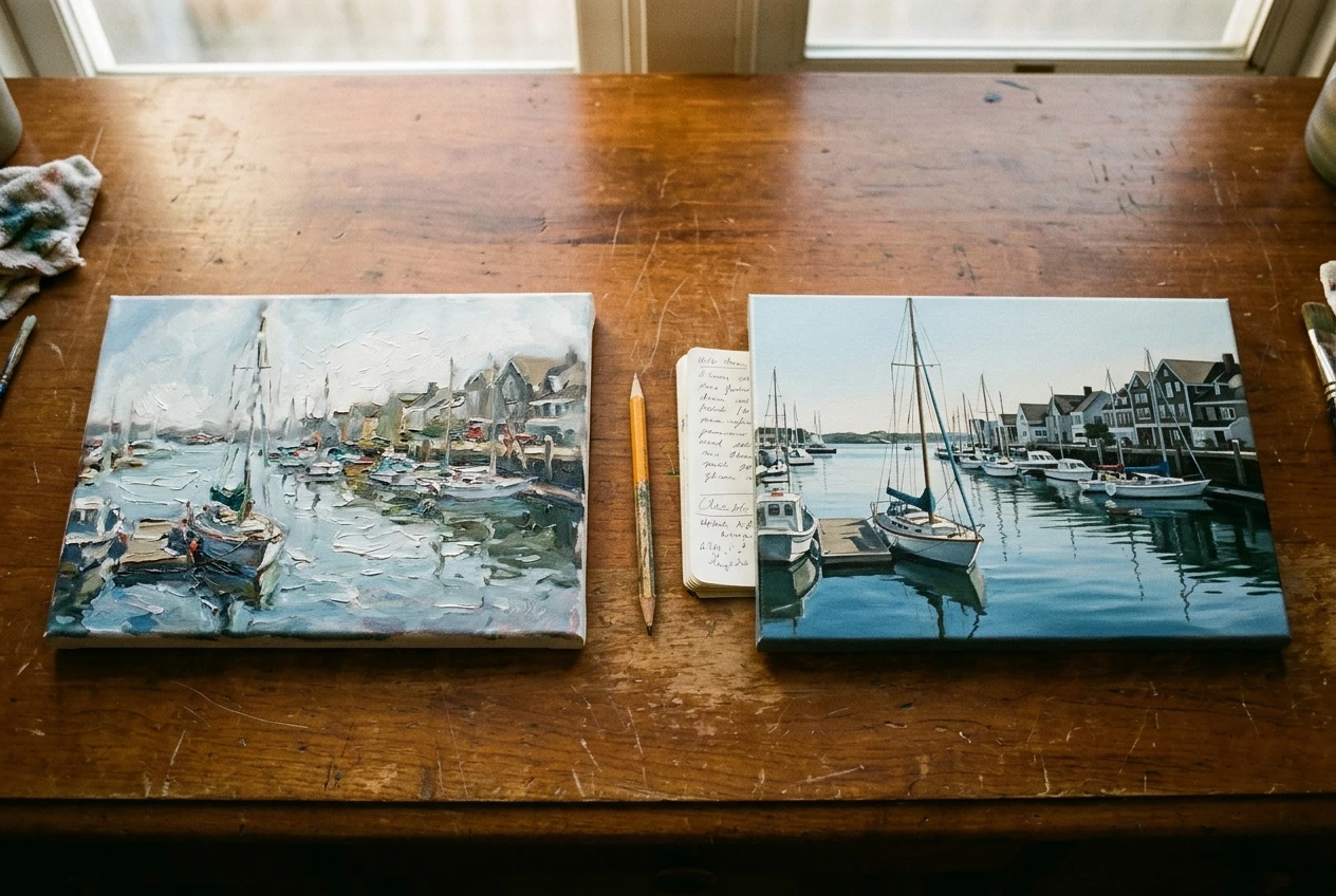
- Swap “soft lost edges” for “crisp hard edges” and see how much of the mood came from edges.
- Swap “thick visible brushstrokes” for “smooth blended brushwork” and see what the mark-making layer contributes.
- Swap the palette phrase for a different one while leaving the light the same.
- Delete the surface layer entirely and see whether the image feels flatter or cleaner.
Compare the images side by side. If a change makes a clear difference, that word is doing real work, and you now know which part of the look it controls. If two images look nearly the same, that word is not carrying weight, so try a more specific term or remove it to keep the prompt short.
Changing several words at once ruins the comparison, because you will not know which change caused the difference. Keep a short note of each test: the one word you changed and what happened. After five or six runs you will have a much clearer idea of the look than any artist’s name could give you.
Where study ends and imitation begins
Studying an artist’s technique is how artists have always learned. Thick paint, soft edges, limited palettes and raking light are techniques shared across centuries of painting, and no one owns them. Describing those qualities in a prompt is study.
Imitation starts when the result is built to be mistaken for a particular person’s work. A few questions help you check where you are:
- Could someone look at your image and name a specific piece it copies?
- Does it depend on a signature character, motif or composition that belongs to one artist, rather than on general technique?
- Is your prompt built around one source, or does it combine influences?
Combining is the simplest safeguard and the best creative habit. Take the edge handling from one image you admire, the palette from another and the surface from a third. The result belongs to your decisions rather than to any one source.
If you plan to sell your work or use it commercially, check the terms of the platform and the rules that apply where you live. Those vary, and they are outside what a prompt-writing method can settle.
Save your own texture vocabulary so every new piece starts faster
After a few rounds of this you will have a set of phrases that work for you. Write them down. A plain document or notes app is enough, with one entry per look you have analysed.
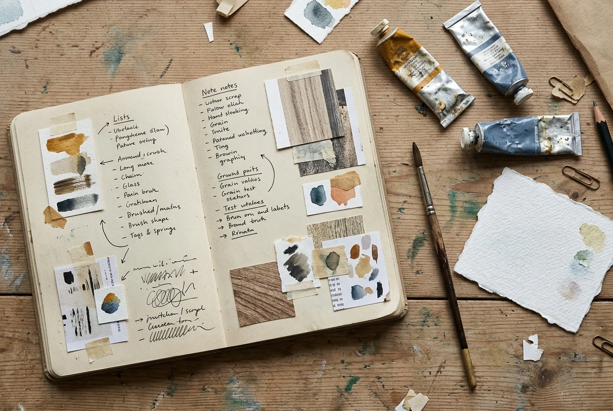
For each entry, record:
- A label in your own words, such as “foggy oil harbor” or “scratchy ink night.”
- The five craft words that define the look.
- The prompt that produced your best result.
- Notes from your one-word tests, including which words changed the image the most.
When you start a new piece, you pull the layers from your list rather than starting from a blank prompt box. A subject you have never tried can take on a texture you have already worked out. Over time the list becomes a personal vocabulary, and it records your taste more accurately than any artist’s name would.
You can also add to it whenever you meet a new look. Each time you see an image you love, run the same four-part reading: marks, edges, grain, surface. Then add palette and light, and write down what you find.
Pick one texture you admire, describe it in five craft words, and run your first side-by-side test in kre8or.ai today.