


How to Use Negative Prompts to Clean Up Crowded Kre8or.ai Scenes
Busy scenes are where a good single-subject workflow stops working. A market stall that looked fine alone turns into a smear of awnings, arms and fruit once fifty other things share the frame. Most people respond by adding more adjectives to the prompt, and that rarely helps.
This article teaches a different approach: work out which kind of crowding problem your image has, then write a short negative prompt aimed at that one problem. You will get three problem types, a starter negative prompt for each, before and after prompts to try in kre8or.ai, and a way to build a small reusable kit for markets, crowds, battles and city streets.
If your generation settings include a negative prompt field, use it for the lists below. If you only have the main prompt box, phrase each exclusion as a positive instruction instead, for example “each figure clearly separate” rather than “no merged figures.”
Why crowded scenes break
An image model does not place objects one at a time the way a painter does. It builds the whole picture at once, adjusting every region so it fits the prompt and looks plausible next to its neighbors. It has no inventory of “person one, person two, person three” and no memory of where one person ends.
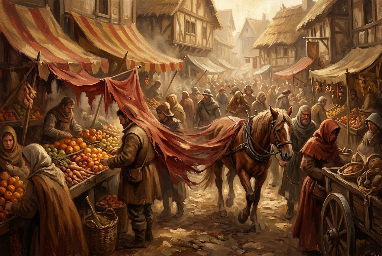
That works well for a single subject, where the whole picture is organized around one thing. In a crowd, hundreds of regions compete for the same pixels, and the model resolves each overlap locally. A shoulder becomes a coat sleeve, a coat sleeve becomes a banner, and the banner becomes a horse. Nothing in the process checks that these should stay separate things.
Three effects follow from this:
- Detail gets thinner as the object count rises. There is a limited amount of image to spend, so each figure gets fewer pixels and less careful rendering.
- The model repeats what it already drew. Copying a face or a stall pattern is the cheapest way to fill a space, so repetition creeps in wherever the prompt says “many” or “crowd.”
- Boundaries are the first thing to go. Edges between neighboring objects are small features, and small features are where the model is least precise.
Knowing this changes how you write the fix. You are trying to protect boundaries, discourage copying and keep detail from dissolving, and each of those calls for different wording.
What a negative prompt actually does (and what it can’t fix)
A negative prompt tells the model what to steer away from while it generates. In practice it lowers the likelihood of features you name, such as blur, duplicates or fused shapes. It works best on things that look like a recognizable quality or pattern: “blurry,” “oversaturated,” “duplicate faces.”
It has real limits, and knowing them saves a lot of wasted generations.
It cannot add anything. A negative prompt can reduce muddiness, but it cannot supply a clear spatial layout. If your positive prompt never says where things are, the negative prompt has nothing to protect.
It cannot count. “Not too many people” is vague, and the model has no reliable way to act on it. Numbers and quantities belong in the positive prompt, where you can describe a specific group.
It cannot fix a prompt that asks for too much. If you request a thousand-soldier battle with close-up faces, fine armor detail and a sweeping landscape, no list of exclusions will make all of that fit. Decide what the image is about first.
It reacts to wording, not meaning. Naming an unwanted thing can sometimes bring up the very concept you meant to remove, because the words still describe it. Plain, visual terms such as “blurry” or “duplicate faces” tend to behave better than long descriptive phrases.
The right expectation is that a short, accurate negative prompt removes one specific kind of flaw. It will not rescue a weak composition.
Diagnose first: merged objects, cloned faces, or muddy artifacts?
Before writing anything, look at your failed image and name the main problem. Most failures in crowded scenes fall into one of three groups, and each has a different cause and a different fix.
Merged objects
Look at the places where two things touch. Do arms grow out of the wrong bodies? Does a stall roof flow into a neighbor’s awning? Do two horses share a head? This is a boundary failure. The model resolved an overlap by blending the two shapes.
Cloned faces and repeated elements
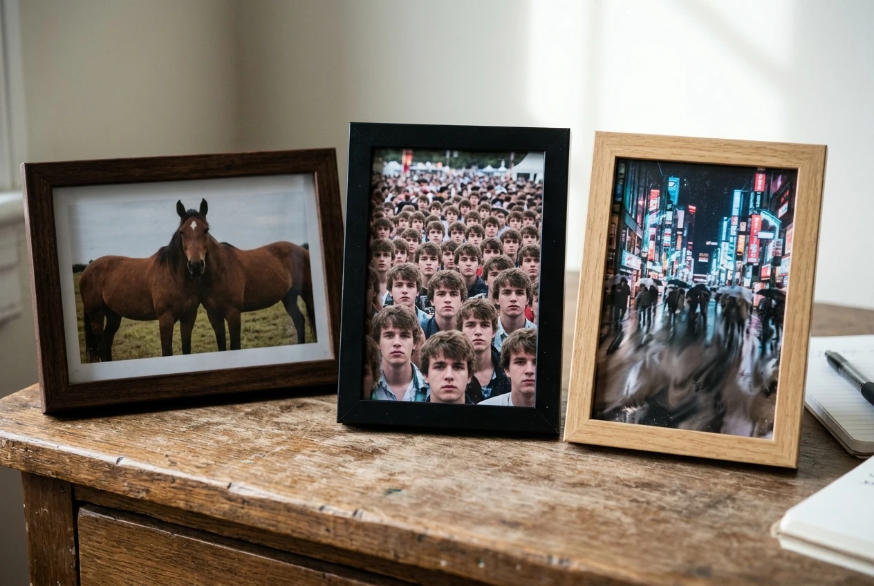
Scan the middle distance. Do several people share the same face, haircut or pose? Do the buildings on a street repeat in a regular pattern, or do identical lanterns march across the frame? This is a repetition failure. The model copied something it had already drawn because copying was easier than inventing.
Muddy artifacts
Look at the image as a whole and at the background in particular. Do colors blend into brown or gray? Is there a layer of noise, smeared texture or detail that looks like scribbles? Muddiness usually appears where the model had too many small things to render and averaged them together.
Real images often show more than one problem. Pick the one that bothers you most and fix that first. If you change three things at once, you will not know which change helped.
A quick test: shrink the image until it is thumbnail size. If it still reads as a clear scene, your problem is probably at the detail level (cloning or merging in small areas). If it looks like a blur of color at that size, the problem is composition or muddiness across the whole frame.
A short negative prompt for each problem, with before and after prompts to try
Each starter list below is short on purpose, with five to seven terms aimed at one flaw. Run the “before” prompt first so you have your own baseline, then run the “after” version with the negative prompt added. Judge the change by looking at the specific problem you diagnosed.
For merged objects
Negative prompt:
merged figures, fused bodies, overlapping limbs, blended objects, conjoined shapes
Before prompt: A busy medieval market square, dozens of villagers, wooden stalls with fruit and cloth, afternoon light, detailed illustration
After prompt: A busy medieval market square, villagers each standing apart with clear space between them, wooden stalls with fruit and cloth, afternoon light, detailed illustration
The “after” version moves the fix into the positive prompt too, by describing separation directly. The negative list then guards against fusion at the boundaries. Compare the places where figures touch stalls and each other.
For cloned faces and repeated elements
Negative prompt:
duplicate faces, identical people, cloned figures, repeating pattern, copy-paste crowd
Before prompt: A huge crowd at a night festival, paper lanterns, many people watching fireworks, cinematic
After prompt: A crowd at a night festival, people of different ages, heights and clothing, paper lanterns in varied colors and sizes, many people watching fireworks, cinematic
The positive changes give the model variety to draw from, which removes the incentive to copy. The negative list discourages the repetition that remains. Check the middle distance, where clones usually appear.
For muddy artifacts
Negative prompt:
muddy colors, smeared details, noisy texture, blurry background, low contrast, washed out
Before prompt: A rainy city street at dusk, traffic, neon signs, pedestrians with umbrellas, shop windows, reflections on wet pavement
After prompt: A rainy city street at dusk, a few cars in the middle distance, neon signs in distinct colors, pedestrians with umbrellas, lit shop windows, clear reflections on wet pavement, strong contrast between light and shadow
Here the positive prompt reduces the object count slightly and asks for contrast, while the negative list targets the smearing. The fix for muddy images often includes doing less, because fewer competing details means less averaging.
Why piling on negative terms backfires
Once a short list helps, it is tempting to keep adding terms: every flaw you have ever seen, in one long block. This usually makes images worse, for several reasons.
Terms overlap and pull against each other. “Blurry,” “out of focus” and “soft” all describe similar things. Listing all three says the same thing three times, which strengthens that one push while leaving less weight for the others.
Some terms remove things you want. “Low detail” and “simple” in a negative list can cause the model to over-render everything, which makes crowded scenes noisier. “Dark” in a negative list will flatten a night scene you wanted moody.
A long list dilutes the instruction that matters. If your real problem is fused bodies and the list also covers watermarks, text, cropping, bad anatomy and six style terms, the fusion terms are a small share of the instruction.
You lose the ability to tell what worked. With twenty terms active, a better image gives you no information about which terms did the work.
How to trim your list
- Start from the diagnosis. Keep only terms that describe the flaw you can see.
- Remove synonyms. Pick the clearest word from each cluster and delete the rest.
- Remove terms that fight your style. Check that nothing in the list contradicts the look you asked for in the main prompt.
- Test by subtraction. Take out one term at a time and generate again. If the image does not get worse, leave the term out.
- Aim for five to eight terms for a given problem. If you need more than that, the problem is probably in the positive prompt.
The goal is the smallest list that removes the flaw you are looking at.
Pair negatives with positive spacing and composition language
Negative prompts remove unwanted outcomes, but the positive prompt decides what the scene is. For crowded images, the positive side needs words that describe layout, because layout is the thing the model is least able to infer.
Useful positive language falls into a few groups.
Depth layers. Tell the model where things sit relative to the viewer: “a few figures in the foreground, a larger group in the middle distance, small distant silhouettes near the horizon.” This gives each region a size and a level of detail, and it stops the model from rendering every person at the same scale.
Spacing words. “Clear space between figures,” “wide aisle through the middle,” “people standing apart,” and “open walkway” all describe room between objects. Room between objects is what protects boundaries.
A focal point. Name one thing the picture is about: “a fruit seller in the center foreground, holding up an orange.” Without a focal point, the model spreads detail evenly and nothing gets enough of it.
Camera and viewpoint. A raised viewpoint (“seen from a balcony,” “high angle”) shows more separation between people than a flat eye-level shot, where everyone overlaps in a line. A wide shot gives each figure fewer pixels but clearer outlines.
Variety. Say that people differ: ages, clothing colors, heights, poses. This is the positive counterpart to “duplicate faces” in the negative list.
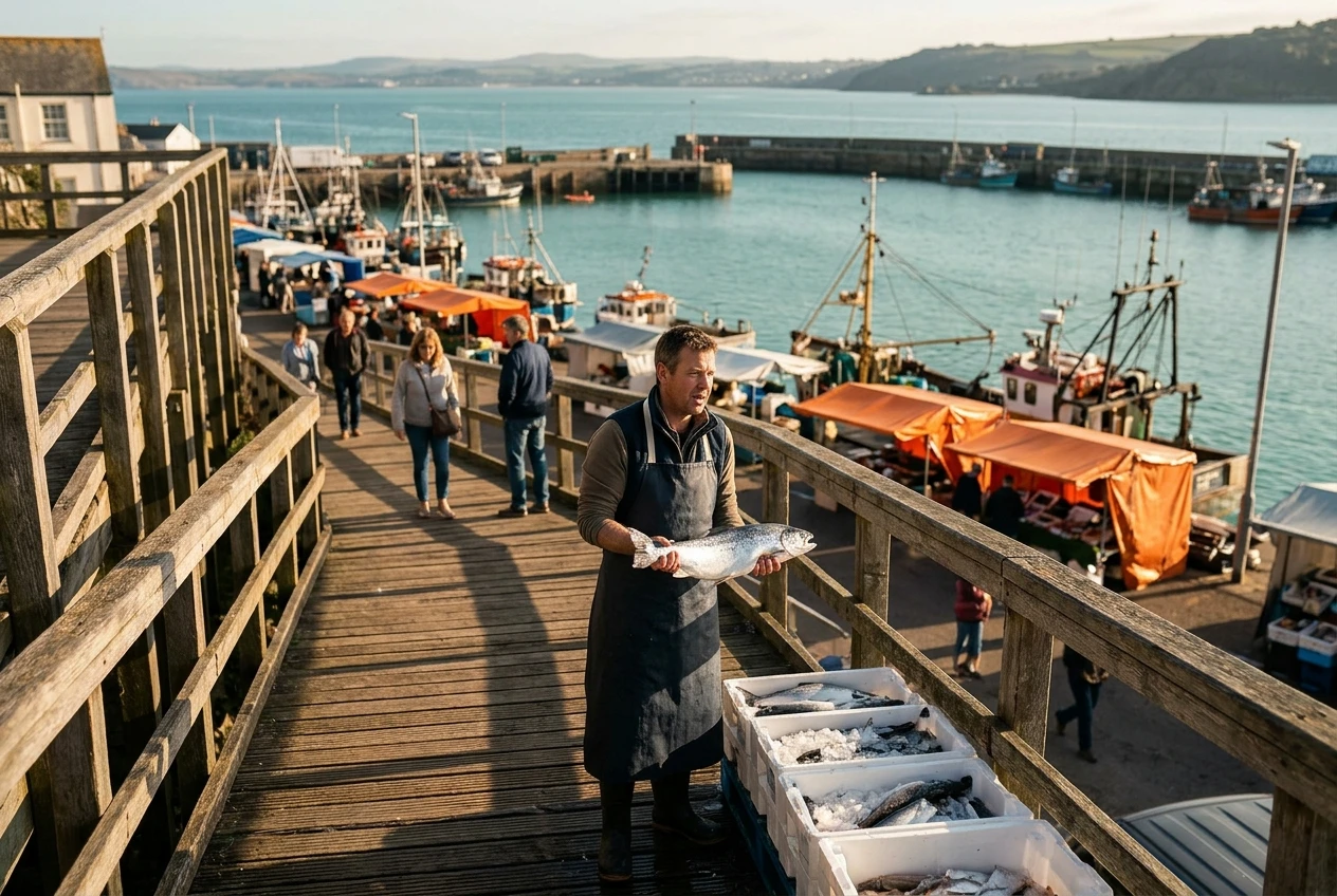
A prompt built this way might read: “A crowded harbor market seen from a raised walkway, a fishmonger in the center foreground holding up a silver fish, a few shoppers in the middle distance with clear space between them, small distant stalls near the water, varied clothing colors, warm morning light.”
Notice that the sentence tells the model how many layers there are and what goes in each one. If you want more on writing the positive side clearly, the article on graphic prompts that turn any idea into art on kre8or.ai covers the basics of structuring a prompt.
Build your own reusable negative prompt kit for busy scenes
Once you have a diagnosis habit, you can stop starting from nothing. A small kit of tested lists, saved in a text file or a notes app, will serve most crowded scenes.
Structure the kit as four short blocks:
Block 1: boundaries.
merged figures, fused bodies, overlapping limbs, blended objects
Block 2: repetition.
duplicate faces, identical people, cloned figures, repeating pattern
Block 3: clarity.
muddy colors, smeared details, noisy texture, low contrast
Block 4: general cleanup, used sparingly.
blurry, distorted, cropped
For each new scene, paste only the block that matches your diagnosis. Combine two blocks if you can see two problems, and avoid combining all four by default. Because each block is short, joining two still keeps the total under a dozen terms.
Add a one-line note to each block about what it did for you and which scene types it suited. A note such as “good for market stalls, flattened my night street” tells you more than the list itself next time you open it. The kit will become more accurate as you edit it.
Keep a separate positive “layout” template as well, with slots you fill in each time: viewpoint, foreground focal point, middle distance, background, and a variety note. The negative kit and the layout template work as a pair, and having both saved makes starting a new crowded scene much faster.
If one of your recurring problems is a particular anatomy issue such as hands, that has its own settings; the guide on fixing extra fingers in AI art is the place for it, and your scene-level kit can stay focused on composition.
Test it on a market, a crowd and a battlefield
The best way to learn which block does what is to run the same three scene types and compare. Each one tends to expose a different problem, which makes them good practice.
A market
Markets stress boundaries, because stalls, goods and people all overlap at close range.
Prompt: A spice market in a narrow old city street seen from a raised walkway, a vendor in the center foreground scooping red powder into a bag, a few shoppers in the middle distance with clear space between them, striped awnings in different colors, warm afternoon light, detailed illustration
Negative prompt: merged figures, fused bodies, blended objects, overlapping limbs
Look at where awnings meet walls and where shoppers meet stalls. If boundaries are still soft, try adding more spacing language to the positive prompt before adding more negative terms.
A crowd
Crowds stress repetition, because the model has the strongest incentive to copy faces here.
Prompt: A crowd gathered in a town square for an evening concert, seen from a high angle, a singer on a small stage in the center, people of different ages and heights in varied clothing, string lights overhead, soft warm light
Negative prompt: duplicate faces, identical people, cloned figures, repeating pattern
Check the middle distance for matching faces and poses. If the foreground is good and the back rows still repeat, reduce the crowd’s size or describe the back rows as distant silhouettes, so the model does not try to render faces there.
A battlefield
Battles stress clarity, because motion, smoke, armor and weapons all add small detail that can turn to mud.
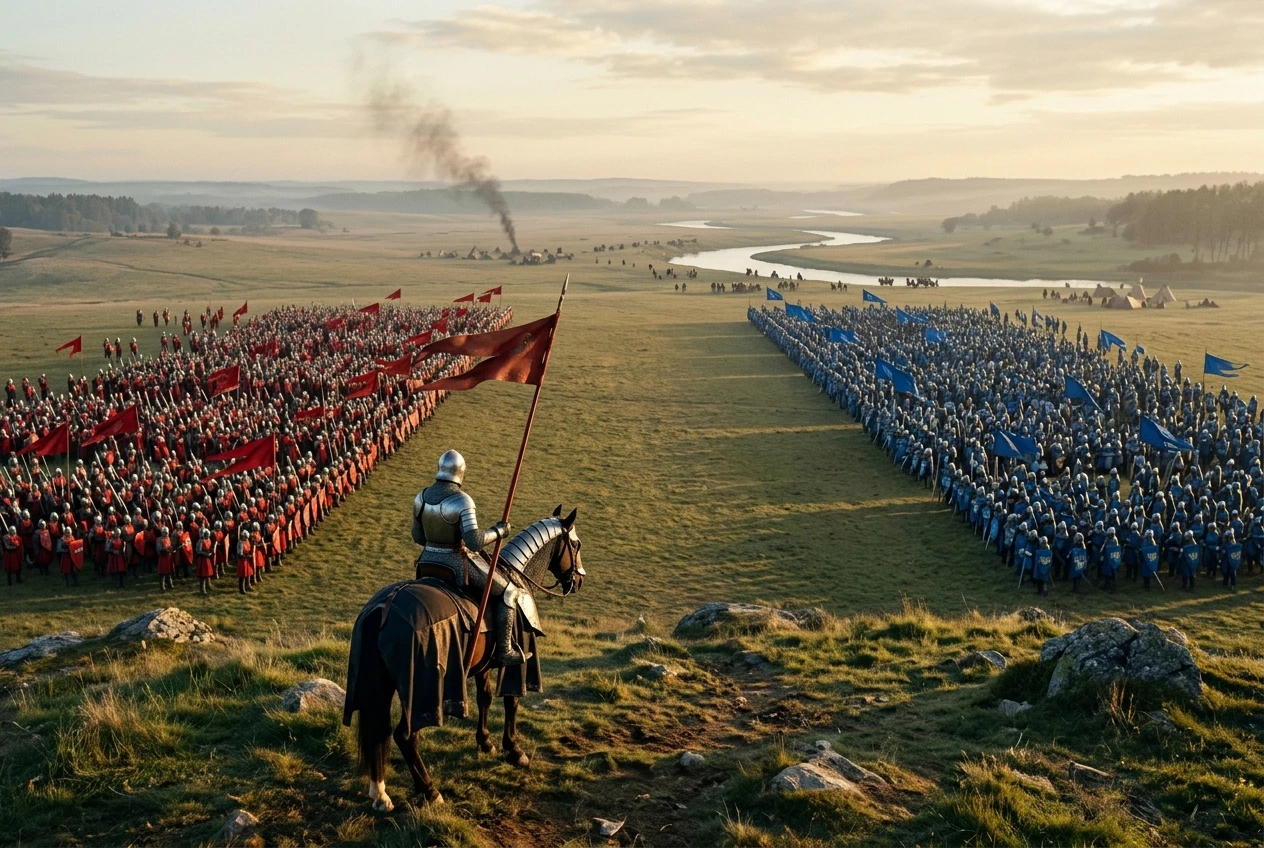
Prompt: Two armies meeting on a grassy plain at dawn, seen from a hill behind one army, a knight with a red banner in the center foreground, lines of soldiers in the middle distance, small distant figures near a river, thin smoke rising, clear separation between the two sides
Negative prompt: muddy colors, smeared details, noisy texture, low contrast
Look at whether the two armies read as two groups, and whether colors stay distinct. If the middle distance is still muddy, simplify it: fewer soldiers, less smoke, and one clear color for each side.
How to compare results
For each scene, generate once with the positive prompt alone, then once with the negative prompt added. Write down what changed in the specific area you were checking. Then change only one thing, either a term in the negative list or a phrase in the positive prompt, and run it again. After a few rounds you will know which words matter for your style and which are noise.
Over time the pattern becomes familiar: boundaries and spacing for merged shapes, variety for repetition, and fewer competing details for mud. Crowded scenes become manageable because you can name what went wrong and answer it with a few words.
Try the negative prompt kit in your own crowded scene on kre8or.ai, and start with the one problem that ruins your images most often.