


Why Your AI Images Look Fake, and How to Prompt Real Light and Texture in kre8or.ai
Most AI images that look fake share the same problem: the prompt says nothing about how light falls on the subject or what the surface does with it. If you want to know how to make AI images look photorealistic, those two things matter more than any quality keyword you can add.
This article gives you a two-part formula for kre8or.ai: one clause for how the light behaves, and one clause for what the surface does in that light. Then it walks through three test subjects so you can see the difference in your own results.
Why “ultra realistic 8k” keeps giving you plastic skin
Words like “ultra realistic,” “8k,” “masterpiece” and “highly detailed” name a quality level. They do not describe a scene. The image generator has to guess what kind of light you mean and what the skin, fabric or metal should look like, and when it guesses, it tends to produce the average of everything it has seen: even lighting from no particular direction, smooth surfaces, and no visible wear.
That averaged look is the plastic one. Real photographs are full of specifics. A window is on the left, so the right cheek is darker. The cheek has pores, and the light skims across them. The jacket has a worn spot at the elbow. None of that appears unless the prompt asks for it.
The fix is a prompt with two clauses placed after your subject:
- Light clause: the source, its direction, how soft or hard it is, its color, and how quickly it fades.
- Surface clause: what each important material does when that light hits it, covering roughness, pores, grain and wear.
Everything below explains how to write each clause well.
Name the light source first
Start with where the light comes from. A named source brings a whole set of behaviors with it, so one phrase does a lot of work. These five cover most situations:
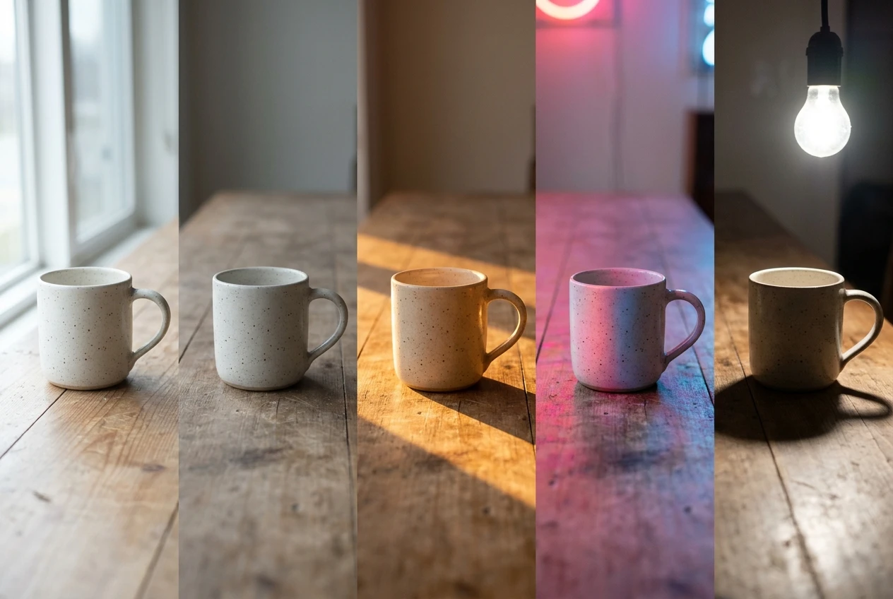
- Window light: directional and fairly soft. One side of the subject is brighter, and the other side falls into gentle shadow. It suits portraits and indoor still lifes.
- Overcast sky: very soft and even, with weak shadows. Colors look muted and skin looks natural. It suits outdoor portraits and product shots where you want no harsh contrast.
- Golden hour: low sun, warm color, long shadows, and bright edges around the subject. It suits landscapes and street scenes.
- Neon: colored light, often two colors from different sides, with color spilling onto skin and wet surfaces. It suits night scenes.
- Bare bulb: hard, small, and harsh, with crisp shadows and a flat yellow cast. It suits gritty interiors and moody portraits.
Write the source as a plain phrase: “lit by a single window on the left” or “overcast daylight.” Avoid vague labels like “cinematic lighting” or “dramatic lighting.” They tell the generator that you want drama but not where the light comes from, so you get a generic result again.
Direction, softness and falloff: the three light words that change everything
Once the source is named, three small additions decide whether the light reads as real.
Direction
Say where the light hits the subject from. “From the left,” “from above,” “from behind,” and “from low in front” produce very different pictures. Light from behind the subject creates a bright outline around hair and shoulders. Light from directly above creates shadows under the brow and nose. Light from the side reveals texture, which matters for the second clause of the formula.
Softness
Soft light has gradual shadow edges, and hard light has crisp ones. A large source like an overcast sky or a big window is soft. A small source like a bare bulb or direct midday sun is hard. Write “soft, diffused” or “hard, crisp-edged shadows” explicitly. Skin often looks plastic because the lighting is soft and flat everywhere. A little shadow definition makes it look more like a photograph.
Falloff
Falloff describes how quickly light fades as it moves away from the source. With fast falloff, the subject near the light is bright and the background drops into darkness. With slow falloff, the whole scene is evenly lit. Most fake-looking images have no falloff at all, so everything is equally bright. Phrases like “light fading quickly into a dark background” or “soft falloff across the face” fix this.
A full light clause might read: lit by a single large window on the left, soft diffused light, warm color, fading into shadow on the right side of the face. That is one sentence, and it describes a physical setup a photographer could build.
Texture is a verb
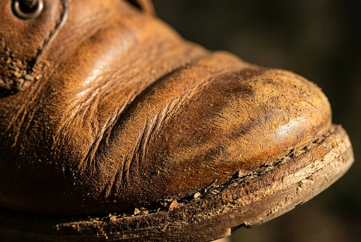
Beginners usually describe texture with adjectives: “detailed skin,” “rough wall,” “shiny metal.” Adjectives tell the generator how a surface should look, but not what it does. Verbs and visible effects work better, because they describe how the surface behaves in the light you just set up.
Compare these pairs:
- “Detailed skin” becomes “visible pores, faint freckles, slight shine on the forehead and nose.”
- “Old leather” becomes “creased leather with scuffed edges and a dull sheen where it bends.”
- “Rusty metal” becomes “flaking paint, orange rust at the seams, scratches catching the light.”
- “Dusty shelf” becomes “a fine layer of dust settling on top surfaces, thicker in the corners.”
- “Film look” becomes “fine film grain, slightly lifted shadows.”
When you write the surface clause, think about four things:
- Roughness: is the surface matte, glossy, or somewhere in between?
- Fine structure: pores, fibers, weave, brush marks, wood grain.
- Grain: the photographic noise across the whole image.
- Wear: scratches, chips, fingerprints, dust, creases, fraying.
Pick one or two textures for your main subject rather than listing everything. A prompt that asks for pores, scars, wrinkles, sweat, freckles and peach fuzz all at once can push the image toward noisy, over-processed skin. Choose the detail that suits the subject and let the rest stay simple.
Putting light and texture together
Here is the formula in one line:
[Subject and setting], [light source, direction, softness, color, falloff], [surface behavior for the main material], [one camera phrase].
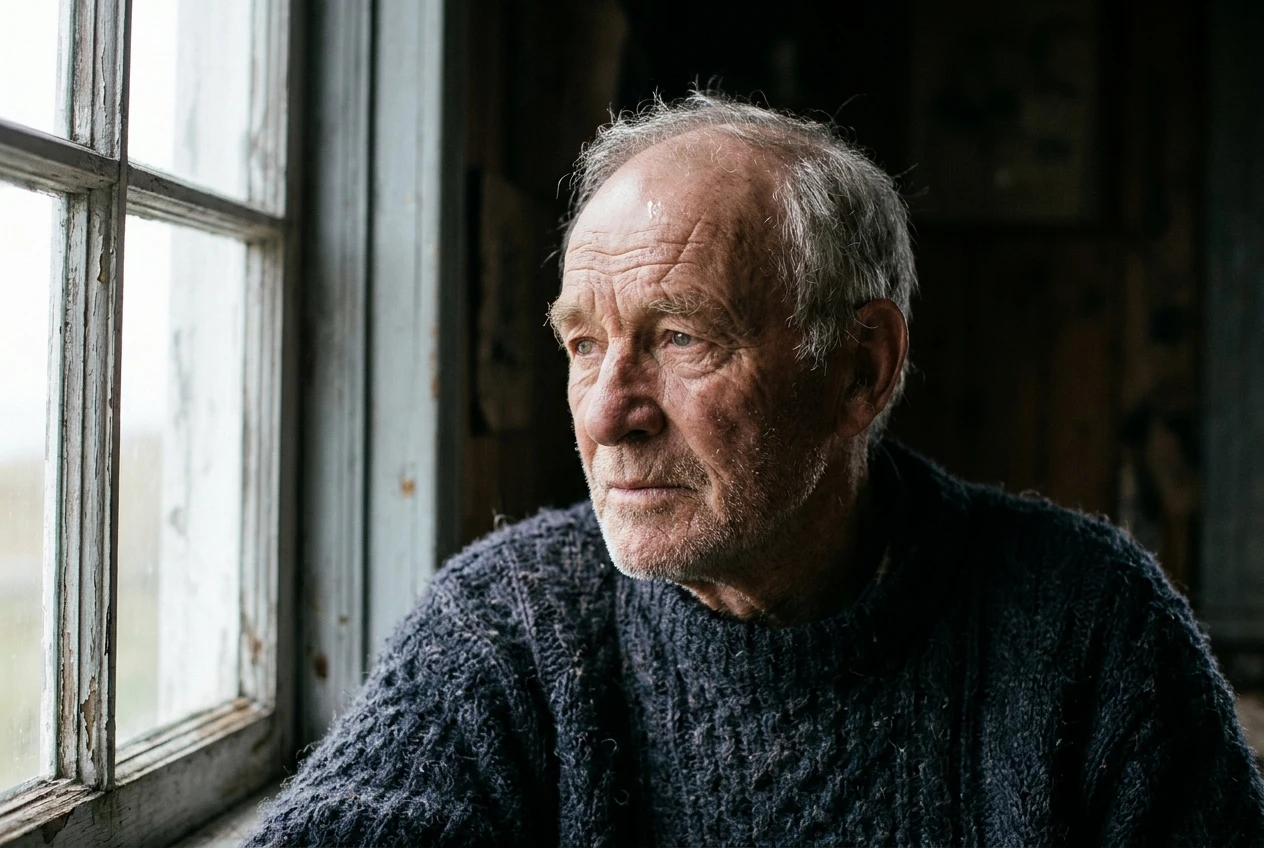
Below are three test subjects. For each one, run the weak prompt first, then the formula prompt, using the same settings in kre8or.ai. Compare them side by side. Look for whether the shadows have a clear direction, whether the surfaces catch light differently from each other, and whether the image still looks smooth everywhere.
Test 1: a portrait
Weak: portrait of an elderly fisherman, ultra realistic, 8k, highly detailed
Formula: portrait of an elderly fisherman in a wool sweater, lit by a single window on the left, soft diffused daylight, cool color, light fading into shadow on the right side of the face, deep wrinkles and visible pores, slight shine on the forehead, coarse wool fibers, fine film grain, 85mm lens
Test 2: an object
Weak: a pair of leather work boots on a table, photorealistic, high quality
Formula: a pair of leather work boots on a wooden workbench, lit by a bare bulb from above and slightly in front, hard light with crisp shadows under the boots, warm yellow cast, dark background, creased leather with scuffed toes and a dull sheen on the bends, dust on the workbench, 50mm lens
Test 3: a scene
Weak: rainy city street at night, realistic, 8k, cinematic
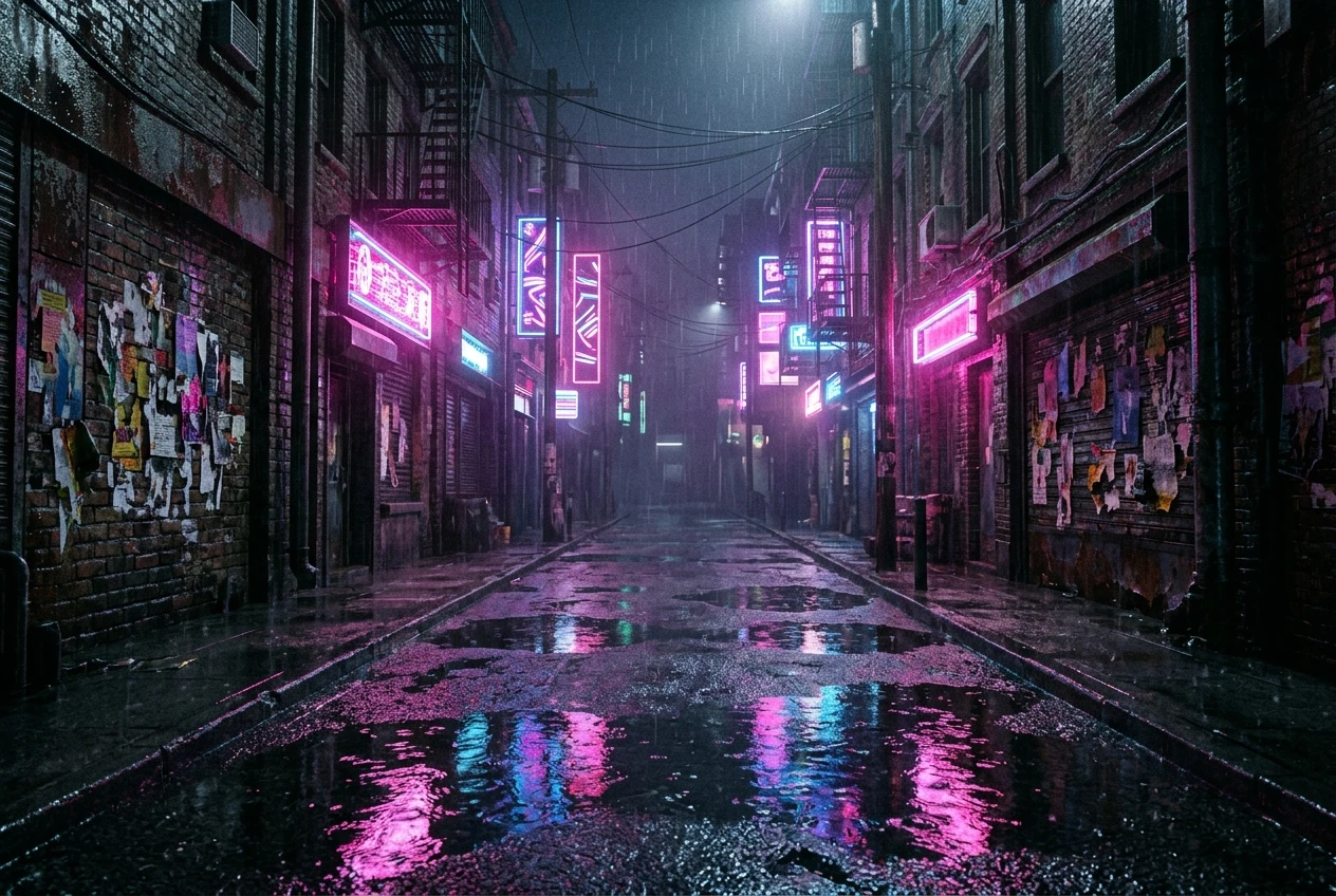
Formula: rainy city street at night, lit by pink and blue neon signs on both sides, colored reflections on wet asphalt, light fading into darkness at the far end of the street, glossy puddles, rough brick walls with peeling posters, fine grain, 35mm lens, shallow depth of field
If the formula version looks closer to a photograph, change one detail at a time to see which one made the difference. Adjusting the light direction or the softness usually changes the picture more than adding extra texture words, which is worth knowing before you add more to the prompt.
Camera and lens language that supports realism
Camera terms work best as a short finishing touch. They influence framing and depth of field, but they do not supply light or texture, so they cannot replace the two clauses above.
A few phrases are enough:
- 85mm lens for portraits, with a flattering, slightly compressed face.
- 50mm lens for objects and general scenes.
- 35mm lens for streets and interiors, with a wider and more natural view.
- Shallow depth of field to blur the background behind a sharp subject.
- Fine film grain to add a photographic texture across the whole image.
Choose one lens and one depth-of-field phrase. If the prompt lists several cameras, film stocks and lens types, those words compete with the light and surface details you worked to write. Put the camera phrase at the end so it reads as a finishing detail.
When the light is right but the hands are wrong
Sometimes you get convincing light and skin, and then notice the hands have too many fingers or bend in odd ways. That is a separate problem from lighting, and a better light clause will not solve it. The article on fixing extra fingers in AI art with the right kre8or.ai settings covers that issue directly.
A practical workaround while you work on it is to compose the shot so the hands are less prominent. Frame the image from the chest up, put the hands in pockets, or have the subject hold an object that hides most of them. Then your light and texture work can carry the image.
Your realism checklist: five quick checks before you regenerate
When an image still looks off, run through these before changing everything in the prompt:
- Is there one named light source? If the prompt only says “good lighting” or “cinematic,” add a specific source like a window, overcast sky or neon sign.
- Does the light have a direction? Look for a bright side and a shadow side. If both sides look equally lit, add the direction.
- Is there falloff? If the background is as bright as the subject, add a phrase about the light fading or the background going dark.
- Does the main surface do something? Look for pores, creases, scratches, dust or sheen. If the surface is smooth everywhere, add one or two specific behaviors.
- Are the quality buzzwords cut? Remove “ultra realistic,” “8k” and “masterpiece,” and spend those words on light and surface details instead.
Change only one thing between generations. If you change the light, the texture and the camera at once, you will not know which edit helped.
Try it yourself
Open kre8or.ai, pick one subject, and run the light-plus-texture formula from this article three times, changing only the light source each time. Window light, overcast sky and neon are a good set to start with, because they look so different from each other. Use the signup link on this page to start generating.