

The Lighting Vocabulary That Makes kre8or.ai Images Look Lit, Not Flat
Most prompt guides treat lighting like an afterthought: one adjective dropped at the end of a long subject description, somewhere after the style and before the aspect ratio. That word does almost nothing on its own. Lighting is a full layer of a prompt, the same way subject, style and composition are layers, and it needs its own vocabulary if you want kre8or.ai to render something that looks lit rather than just visible.
This piece treats lighting as that separate layer. You will see direction words, quality words, color temperature words and mood words, and how to combine them so they describe one coherent light source instead of three contradictory ones. None of this is specific to portraits or any single subject. It works on a product shot, a landscape, a character illustration, anything you are already prompting.
Why your prompts need a lighting layer, not just a lighting word
A single lighting word like “dramatic lighting” or “nice lighting” tells the model almost nothing concrete. Dramatic could mean a hard spotlight from above, a single candle in a dark room, or a sunset silhouette. The model has to guess, and it will often default to something generic and flat because it has no real instruction to follow.
A lighting layer answers four questions instead of one: where is the light coming from, how hard or soft is it, what color is it, and what mood is it building. You do not need an essay for this. Four or five well-chosen words, placed together in the prompt, do the job a vague adjective cannot.
Think of it the way you’d think about describing a photograph to someone who cannot see it. “Good lighting” tells them nothing. “Backlit, soft, warm, late afternoon” lets them picture the actual scene. kre8or.ai responds the same way: the more specific and internally consistent your lighting description, the more it has to work with.
Direction first: rim light, backlight, side light and what each actually changes
Direction is the first decision, because it changes the shape of everything else in the image, not just the brightness.
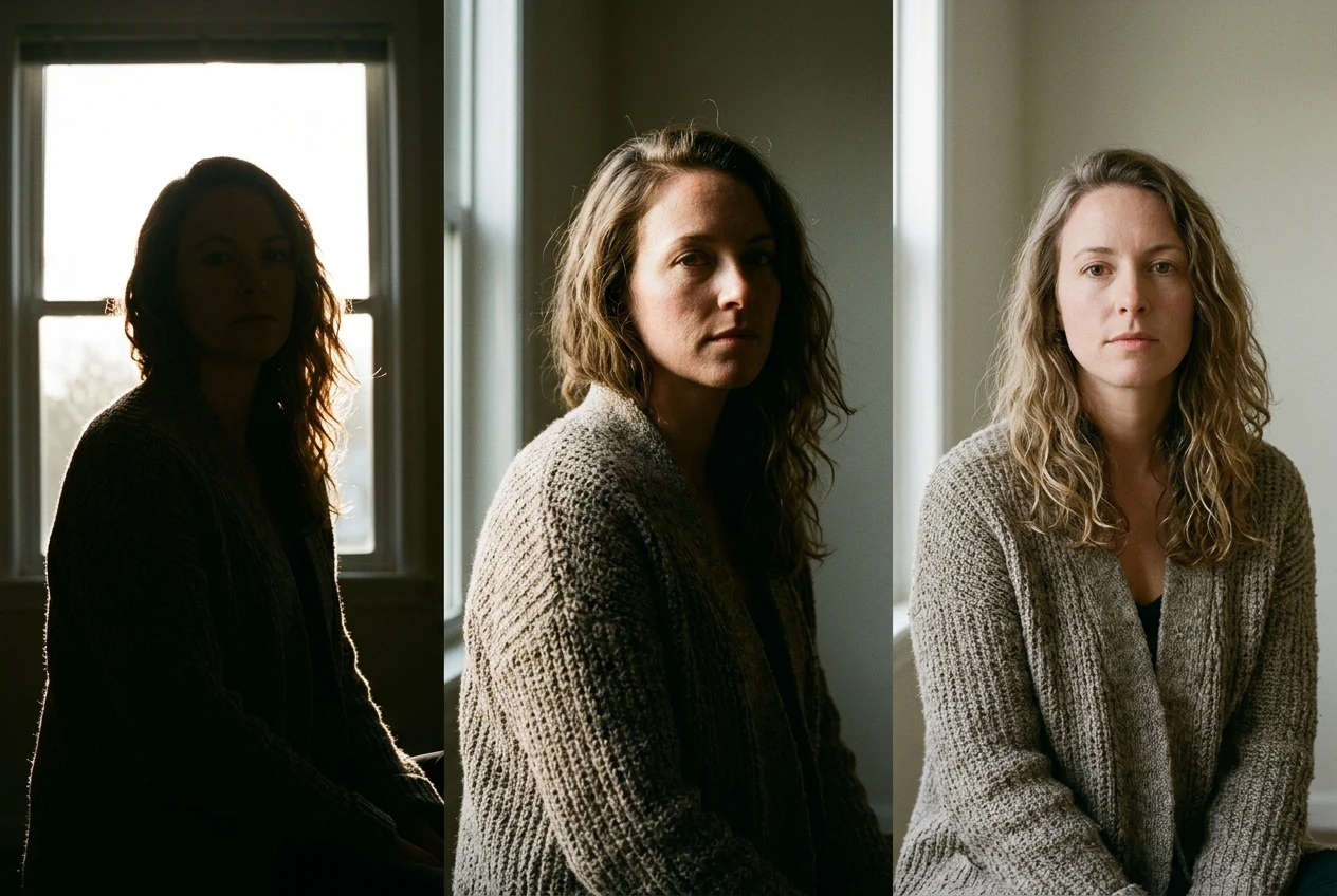
- Backlight puts the light source behind the subject, facing the camera. It creates silhouettes, glowing edges and a sense of depth, because the subject is darker than its surroundings. Use it when you want atmosphere over detail.
- Rim light is a tighter version of backlight: a thin line of light tracing the edge of the subject, usually the hair, shoulders or the outline of an object, while the front stays in shadow or receives separate, softer light. It is the word to reach for when you want a subject to feel separated from the background without changing the whole exposure.
- Side light comes from the left or right, roughly level with the subject. It is the workhorse of direction words because it reveals texture: skin pores, fabric weave, brick mortar. If your renders look smooth and a little plastic, side light is often the fix.
- Front light is flat and even, good for product shots where you want clarity and no mystery, bad for anything you want to feel three-dimensional.
- Top light and underlight are worth knowing even though you’ll use them rarely. Top light, light falling from directly above, reads as harsh and clinical, or as natural midday sun. Underlight, from below the subject, reads as unnatural immediately, useful only when that is the point.
Pick one direction word and let it do its job before you add anything else. Stacking two conflicting directions, like “backlit, front-lit” in the same prompt, gives the model two competing instructions and it will average them into something muddier than either.
Quality of light: hard versus soft, and the words kre8or.ai responds to for each
Direction tells the model where the light comes from. Quality tells it how that light behaves once it hits the subject, and it is the difference between a cheap flash photo and something that looks shot with intention.
Hard light comes from a small, concentrated source, relative to the subject, and produces sharp-edged shadows and strong contrast. Words that reliably call this up: hard light, harsh sunlight, spotlight, direct flash. These work well for anything you want to feel tense, dramatic, or high-stakes.
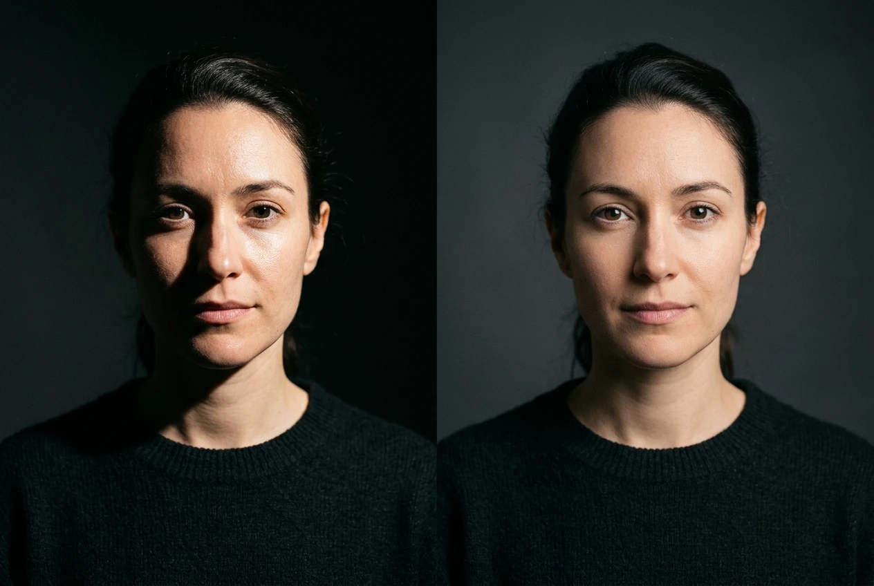
Soft light comes from a large or diffused source, and produces gentle, gradual shadows with low contrast. Words that call this up: soft light, diffused light, overcast light, window light, softbox lighting. These work well for anything you want to feel calm, flattering, or natural.
A common mistake is pairing a hard-light word with a soft-light mood word, like “harsh sunlight, dreamy atmosphere.” The model will try to satisfy both and usually lands somewhere washed out and indecisive. If you want a dreamy mood, pair it with soft, diffused or hazy light words, not harsh ones. Quality and mood need to agree with each other before you add them both to the same prompt.
Color temperature and time of day: golden hour, blue hour, moonlight, neon wash
Color temperature is where a lot of the perceived “professional” quality in lit images actually comes from, more than direction or quality alone. Warm and cool light read as entirely different emotional registers even on an identical subject and pose.
Time-of-day words are the easiest entry point because they carry color temperature built in:
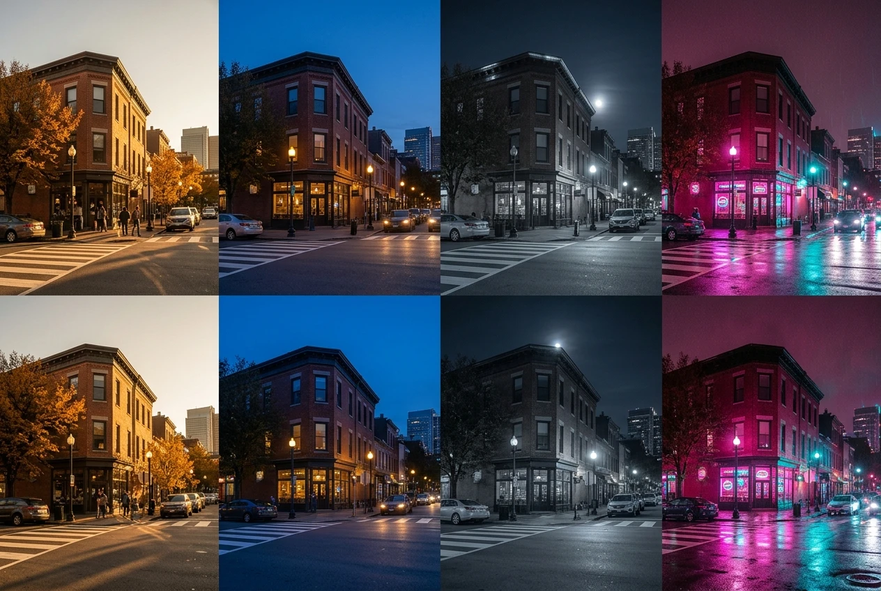
- Golden hour gives warm, low-angle, amber-orange light with long shadows. It is the most forgiving warm-light phrase to use because kre8or.ai has seen it described thousands of times in photography contexts.
- Blue hour gives the cool, dim, saturated blue light of dusk or just before sunrise, with little to no shadow definition. Good for moody, quiet scenes.
- Moonlight gives a cool, low-intensity, often desaturated look, frequently with a slight blue or silver cast. Different from blue hour in that it implies night and a single visible or implied light source rather than ambient sky light.
- Neon wash or neon glow gives saturated, often mixed-color light, typically pink, cyan or magenta, associated with urban night scenes. If you have read the cyberpunk portrait prompt guide, this is the same color vocabulary at work, just applicable well beyond that one subject.
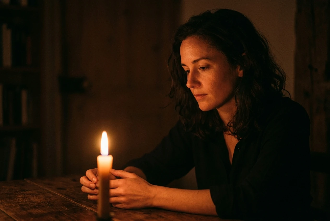
- Candlelight and firelight give warm, flickering, low-intensity light with soft, moving shadows. These read as intimate rather than dramatic.
You can also just state the temperature directly: warm light, cool light, tungsten light, fluorescent light. These are blunter than the time-of-day words but useful when you need precision, like a specific indoor scene that is not trying to evoke a time of day at all.
Naming the mood: chiaroscuro, volumetric light, god rays and when to reach for them
Mood words describe the overall emotional character the lighting creates, and they work best layered on top of direction, quality and color rather than replacing them.
Chiaroscuro describes strong contrast between light and dark areas, classically associated with Renaissance painting. Use it when you want deep shadow alongside a clearly lit subject, rather than even exposure throughout. It pairs naturally with hard side light or a single visible source.
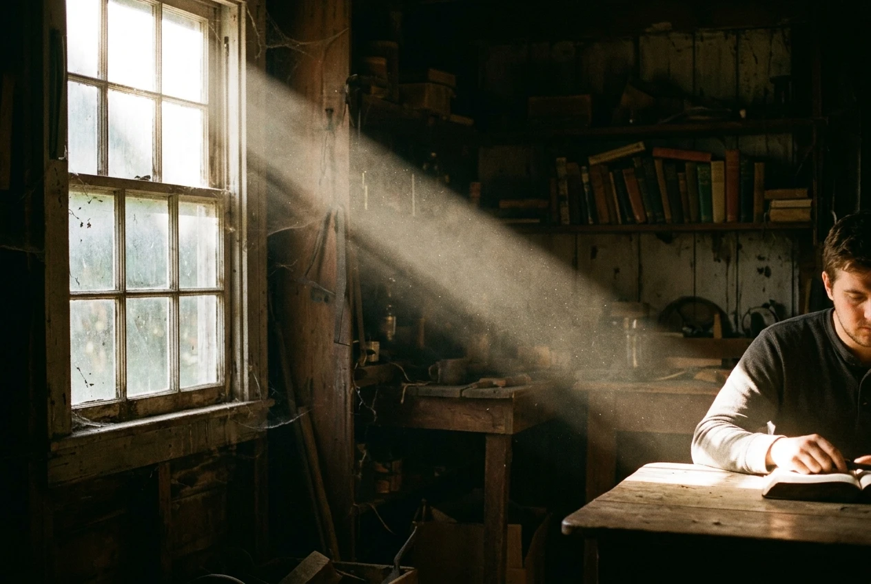
Volumetric light describes visible light rays passing through a medium like fog, dust or smoke, the beams themselves becoming visible rather than just the surfaces they hit. It adds depth and atmosphere to a scene, especially useful for anything with a window, a forest canopy or an industrial interior.
God rays is a more specific version of volumetric light: distinct, fan-shaped beams breaking through clouds or gaps, usually associated with an outdoor, almost biblical sense of scale. Use it sparingly; it is a strong effect that can overwhelm a smaller or quieter subject.
Rembrandt lighting is a portrait-specific mood term worth knowing even outside portraits: a small triangle of light on the shadowed cheek, created by a single light source at roughly 45 degrees. It signals a classical, painterly treatment rather than a photographic one.
Mood words are the seasoning, not the meal. One is usually enough. Two mood words stacked together, like “chiaroscuro, volumetric light, god rays” all at once, tend to cancel each other’s clarity rather than compound the effect.
Stacking lighting words without them fighting each other
The real skill is combining four layers, direction, quality, color and mood, into a short phrase that reads as one coherent light source rather than a list of effects.
A working order to try: direction, then quality, then color or time of day, then mood, each separated by commas within the lighting portion of your prompt. For example: “backlit, soft light, golden hour, slight haze.” Notice none of these words contradict each other. Backlight plus soft light plus golden hour plus haze all describe the same late-afternoon, slightly hazy outdoor scene from different angles.
The failure mode is mixing words that describe incompatible physical situations: “front-lit, hard shadows, moonlight, volumetric fog” asks for flat lighting and deep shadows in the same breath, under a weak light source that would not realistically cast either. The model will try to please every word and produce something indecisive. Before you commit to a lighting phrase, read it back and ask whether it could describe one real photograph. If you can picture it, kre8or.ai usually can too.
For more on how lighting words sit alongside subject and style in a full prompt, the graphic prompts breakdown covers prompt structure in more depth.
Three lighting combinations to copy and adapt today
These three are built to be dropped straight into an existing prompt’s lighting slot, then adjusted to taste.
- Warm and intimate: “side light, soft light, candlelight, warm tones.” Good for portraits, interiors, anything you want to feel close and quiet.
- Cinematic and tense: “backlit, hard light, blue hour, chiaroscuro.” Good for action scenes, moody character work, anything with stakes.
- Bright and atmospheric: “front light, soft light, golden hour, volumetric haze.” Good for landscapes, outdoor scenes, anything that needs warmth without harsh shadow.
Each of these is four words doing the job a single adjective never could. Try one on a subject you have already prompted before and compare the result against your original lighting word. The difference tends to be immediate.
Open a free kre8or.ai account and test these lighting combinations on your own subject before you commit to a full prompt.